
Art Journaling for Beginners: A Practical Guide to Getting Started
A practical guide to starting an art journal — what materials you actually need, how to begin without artistic training, and how to keep the practice sustainable past the first month.
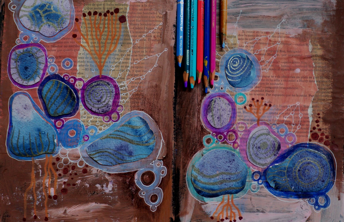
What an Art Journal Actually Is
An art journal is a notebook where the primary mode is visual rather than written. Paint, collage, drawing, color, and texture do most of the work. Words still appear, but they tend to sit inside the images rather than the other way around.
That distinction matters because the term gets used loosely. A written diary with the occasional sketch is closer to a visual journal. An art journal is the version where the page would still mean something if you removed the writing entirely.
This does not make it more advanced. It is simply a different practice with different rhythms. If words have always felt insufficient for what you wanted to record, or if you have a quiet desire to make things with your hands but no project to attach that desire to, an art journal is one of the lowest-barrier ways to begin.
Why People Stall Before Starting
Most people who think about starting an art journal do not start. The reasons are predictable and worth naming, because they tend to be the same reasons.
The first is the belief that you cannot draw. Almost no one who keeps an art journal would describe themselves as a competent draftsperson. The pages are not portfolio pieces. The skill being developed is closer to attention than to technical drawing, and the bar to begin is much lower than people assume.
The second is the cost of supplies. Art journaling is marketed alongside expensive materials — special inks, hand-bound notebooks, dozens of pens. None of that is required. A minimal kit costs less than a paperback book.
The third is the precious-notebook problem. A new blank notebook can feel too important to mark up. The first page becomes a barrier. We will come back to this, because it is the most common point where new art journalers freeze.
The fourth is comparison. The art journals that circulate on social media are filtered, photographed in good light, and selected from a much larger pile of less impressive pages. Real art journals contain weak entries, abandoned spreads, and pages the maker would never share. Forgetting this guarantees disappointment.
None of these obstacles is real in the way it feels. Each one dissolves once you have a working notebook in front of you.
What You Actually Need
A starter art journal kit is smaller than most people expect. The longer the supply list, the less likely the practice is to begin.
One notebook with reasonably thick paper. Standard journal paper buckles under wet media and tears under glue. You want paper rated for mixed media or watercolor — typically 100 gsm or higher, ideally closer to 200 gsm if you plan to use paint. Hardcover bindings hold up better than soft ones once pages thicken with collage.
One waterproof black pen. A fineliner like a Pigma Micron, or any pigment-based waterproof pen, does the most work in an art journal. It writes cleanly, sketches well, and survives water-based color washes laid over it. One good pen is more useful than a drawer of mediocre ones.
A small set of color in one medium. Choose one. Colored pencils are dry and forgiving. Watercolor in a small travel palette covers a lot of ground with little equipment. Acrylic markers are bold but expensive and harder to control. Pick the medium that feels least intimidating. Twelve colors or fewer is enough for a long time.
A glue stick. This bridges drawing and collage. With a glue stick you can attach magazine pages, photographs, ticket stubs, fabric scraps, packaging, and torn paper. PVA and matte medium come later if at all.
A pair of small scissors. Optional but helpful if you plan to cut shapes rather than tear them.
That is the entire kit. Anything else you add later should be added because something specific in your practice asked for it, not because a list told you to buy it.
Choosing the First Notebook
The single decision that most affects whether you keep an art journal is the notebook itself. Pick poorly and the pages will frustrate you. Pick well and you stop noticing the paper, which is what you want.
A few qualities matter more than brand.
Paper weight should be at least 100 gsm. Lighter paper warps under water and tears under glue. If you plan to use any wet media, 200 gsm or higher is more comfortable.
Size affects how willing you are to fill a page. A4 or larger feels ambitious but can feel oppressive for daily use. A5 or smaller is faster to fill and easier to carry. Many people start with something around A5.
Binding affects how flat the notebook lies. Spiral bindings open completely and stay open, which makes painting easier. Hardcover stitched bindings are more durable and feel more substantial, but may need a weight to stay open.
Pages should be blank or dot grid. Ruled pages constrain composition. Dot grid is unobtrusive enough to ignore and useful when you want light alignment.
You do not need an art-store sketchbook. Inexpensive mixed media notebooks from a stationery shop work well for a first year of practice.
The Precious-Notebook Problem
The blank first page is where most art journals stop before they start. The notebook feels too important to mark up. Anything you put on the first page feels like a declaration.
The cure is to deliberately spoil the page. Make a mark — any mark — that signals this notebook is not a museum piece. A few color swatches. A messy date in the corner. Your name written carelessly. A line of paint scribbled across the page. Anything that breaks the spell of the perfect blank surface.
Some people leave the first page blank and start on page two. Others fill the first page with a key — colors they tend to use, abbreviations for their materials, the date the notebook began. Both work. The point is to put the perfection question behind you on day one rather than letting it block every page that follows.
A useful sentence to write somewhere in the front: "This notebook is for practice, not display." You do not have to mean it yet. Writing it makes it easier to believe later.
A Simple Structure for Each Page
A common mistake when starting is to try every technique at once. The page becomes crowded. The layers fight each other. The entry feels exhausting rather than satisfying.
A more sustainable approach is to think of each page in two parts: a ground and a few deliberate marks on top.
The ground is whatever covers most of the page. It can be a wash of one color, a piece of patterned paper glued down, a page from a damaged book, or simply the white of the paper itself. The ground sets the temperature of the page.
The deliberate marks are what you add. A few sentences of writing. A small sketch. A single photograph. A pasted scrap. The deliberate marks should be limited — three or four elements, not ten — because each one needs space to be readable.
Starting each entry by asking what the ground is and what the three or four elements on top will be tends to produce pages that settle into coherence without requiring you to plan further.
Working in Layers
Most art journal pages have more than one layer. The order in which you put them down matters more than the materials themselves.
The general principle is wet to dry, light to dark, background to foreground.
Wet media goes first. Watercolor, ink wash, light acrylic — anything water-based needs a dry page to sit on top of. Once it is down, the page must dry fully before the next layer, or everything afterward bleeds.
Light colors go before dark ones. It is much easier to add a darker accent on top of a pale wash than to recover a light area after dark has covered it.
Collaged elements can go almost anywhere but tend to anchor a page best once the ground is established. Glue onto a wet page and the paper buckles and tears.
Writing usually goes last. Handwriting needs a stable surface to land on, and trying to write across a freshly painted page produces frustrated lines and unreadable text.
You do not have to follow this order strictly. But when a page is not working, the most common cause is that the layers were added in the wrong sequence.
Page Formats Worth Knowing
A few page structures are worth keeping in mind, because they give you somewhere to start when you do not know what an entry should look like.
Color field with a single image. Cover the page in one or two colors. Place one drawn or pasted image on top. Add one line of writing if you want one.
Half and half. Divide the page into two roughly equal areas. One half holds a wash of color, an image, or a sketch. The other half holds writing.
Grid of fragments. Divide the page into six or nine boxes. Fill each box with one small thing — a tiny drawing, a word, a color swatch, a stamp, a single sentence. Each box is a piece of the day.
Single image, paragraph beneath. Glue or draw one image that fills most of the page. Below it, write a short paragraph. The image carries what cannot be said in words. The paragraph carries the specifics.
Repeated mark. One mark — a circle, a leaf shape, a small face — repeated across the page in different colors or sizes. A short note in the corner about why this mark today.
You do not need a different format every entry. Most people settle into two or three structures that match their handwriting, their materials, and the kind of attention they tend to bring.
Drawing Without Knowing How to Draw
The biggest internal barrier for new art journalers is not materials. It is the belief that they cannot draw.
Almost everyone can draw well enough for an art journal. The drawings on these pages are not for evaluation. They are records of having looked at something. A poorly proportioned coffee cup, drawn in two minutes while the coffee cooled, has done exactly what it needed to do.
A few specific things help.
Draw from observation, not imagination. Imagination requires you to invent. Observation only requires you to look, which is much easier.
Use contour lines rather than shading. A simple outline of an object is enough. You do not need to render volume or texture unless you want to.
Draw small. A small drawing requires fewer decisions than a large one. A two-inch sketch in the corner of a page can be done in a minute and feels far less precious than a half-page drawing.
Draw familiar objects. A mug. A plant on the windowsill. A pair of glasses. The things you already know how to see are easier to draw than things you have to study.
Accept what you make. A drawing in an art journal is not for grading. The next page holds another drawing. The cumulative practice is what matters, not the single page.
Using Color Without a Plan
Color is where many beginners get tangled. The fear is that they will pick the wrong combination, the wrong technique, and ruin the page.
A few principles make this easier.
Choose two or three colors per entry and stick with them. Limited palettes look more deliberate than full ones, and they remove the constant decision of what color to reach for next.
Use color to fill space, not to render objects accurately. A wash of yellow behind some writing changes the feel of the page without requiring you to color anything specifically. A single colored shape next to a sketch adds presence without demanding precision.
Test colors on a back page first if you are using paint or markers. A small swatch tells you what a color actually looks like on this paper, and prevents surprises on the page that matters.
Let color overlap text. Writing through a wash of color, or laying color over writing, makes the two feel like part of the same surface rather than separate elements stacked on top of each other.
If you make a mark you regret, do not stop. Add another mark beside it, paint over it, glue something on top of it. Art journals get more interesting as imperfections accumulate, not less.
Where Collaged Material Comes From
A common stall is sitting down to a page with nothing to glue in. The fix is to collect over time rather than search at the moment of writing.
A small folder, envelope, or zippered pouch kept near the notebook can hold things as they arrive — receipts you do not throw away, magazine pages torn out for their colors, ticket stubs, small printed photographs, fragments of packaging, pieces of pretty paper, pressed leaves, old book pages, junk mail with interesting type.
When you sit down to a page, you reach into the folder. You do not need to find the perfect element. You need an element with presence — a color, a face, a shape, a texture — that you can place on the page to anchor what you are doing.
Printed photographs from your phone work especially well. A single small photo from the past week, printed at any drugstore at wallet size, gives the page a specificity that drawing alone cannot provide.
The longer you keep the practice, the more naturally you start to see collectible material in ordinary places. The folder fills itself.
Rhythm and Sustainability
The most common reason people abandon art journaling is overcommitting at the start. They buy expensive supplies, plan an elaborate practice, and try to make every page impressive. Within a few weeks they are exhausted, and the notebook becomes a reminder of failure.
A more durable rhythm is the opposite.
Buy minimal supplies. Make small, fast entries. Aim for one entry a week, taking fifteen to thirty minutes. Let the practice settle into something you can sustain without effort. Add complexity only when the simple version feels insufficient.
Daily art journaling is possible but rare. Most people who keep an art journal for years do so weekly or less. The deeper rhythm of art journaling tends to be slower than written journaling because each page asks more of you. A weekly practice that lasts five years produces a much richer record than a daily practice that ends in a month.
If you skip several weeks, do not catch up. Open the notebook to the next blank page and put something down. The gap is part of the record.
Common Pitfalls
A handful of mistakes recur for new art journalers. Knowing them in advance shortens the learning curve.
Buying too much before starting. A drawer of unused supplies does not produce a journal. Begin with the minimal kit. Add only when the existing materials are genuinely insufficient.
Trying to make every page beautiful. An art journal contains weak pages. Pages where the colors fight, the composition is awkward, the layers feel random. The next page is always available. The cumulative practice is what matters.
Comparing pages to social media. The pages you see online are filtered, photographed in good light, and posted only because they were the strong ones from a much larger pile. Real journals are full of pages no one would share.
Treating the notebook as a portfolio. An art journal is a record, not a body of work for review. The internal pressure to make it look good will end the practice faster than almost anything else.
Skipping writing entirely. Pages without any text tend to lose meaning over time. The image alone does not carry enough context. Even a date and one sentence anchors a page well enough that it stays readable to you years later.
Quitting after one bad spread. One unsatisfying spread is part of any honest practice. Move on. Do not let a single page convince you the practice is not for you.
When the First Month Is Behind You
The first month of an art journal is the hardest. The notebook is still strange. Your habits are still forming. The pages have not yet started to talk to each other.
By the second month, something shifts. You stop being afraid of the next page. You develop preferences — colors you reach for, formats you return to, sizes that suit your handwriting. The notebook starts to feel like yours.
This is also when many people make the mistake of becoming ambitious. They have proved they can do this, and the temptation is to make the practice bigger. Usually the better move is the opposite — stay small. The practice that lasts is the one you can do without thinking about whether to do it.
A second notebook, when this one fills, is often a marker that the practice has taken hold. The first notebook is the proof. The second is the commitment.
What This Practice Becomes
An art journal kept consistently for a year is a different kind of object than a written diary of the same length.
You can flip through it and see the year visually before you read any of it. The colors of the pages move with the seasons. The faces and places that mattered to you reappear. Particular weeks reveal themselves as denser pages with more layers. Quieter weeks show as plain washes or simple sketches.
This kind of record is harder to summarize than a written one, but it is often easier to re-enter. A glance at a painted page from a particular month brings back the feel of that month in a way that a paragraph of prose may not.
An art journal is not therapy, and it is not art. It is a way of paying attention to your life and leaving evidence of that attention behind. The materials are the means. The practice is what matters.
Begin with a notebook, a pen, a glue stick, and one small set of color. Make a single page this week. Whatever it ends up being is enough.
Was this article helpful?
Thanks for your feedback!


